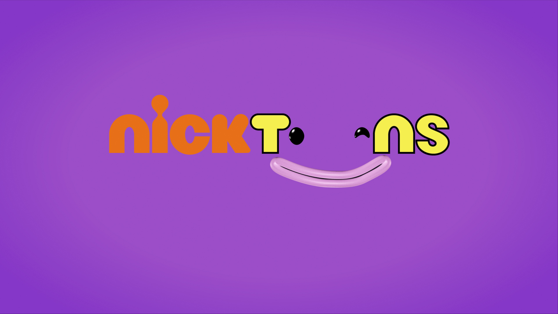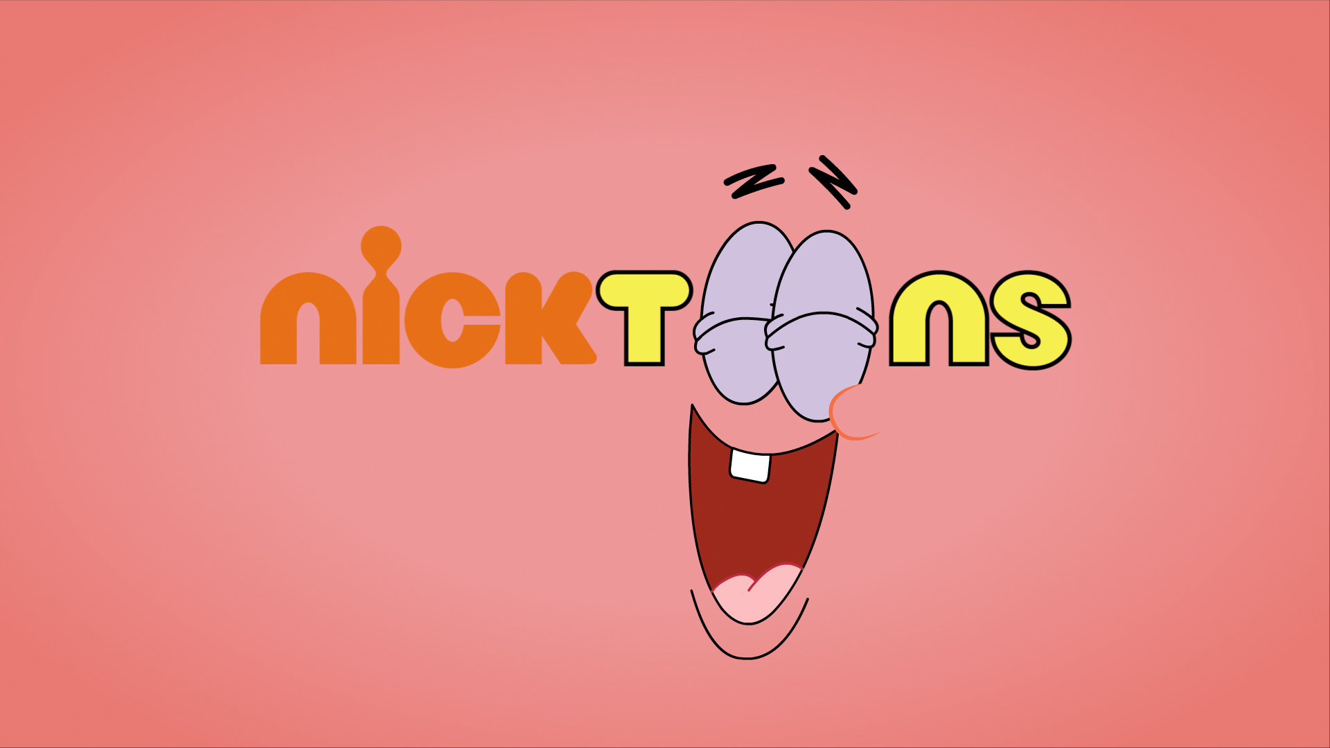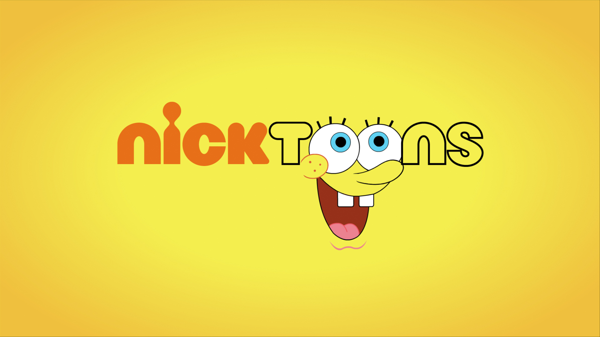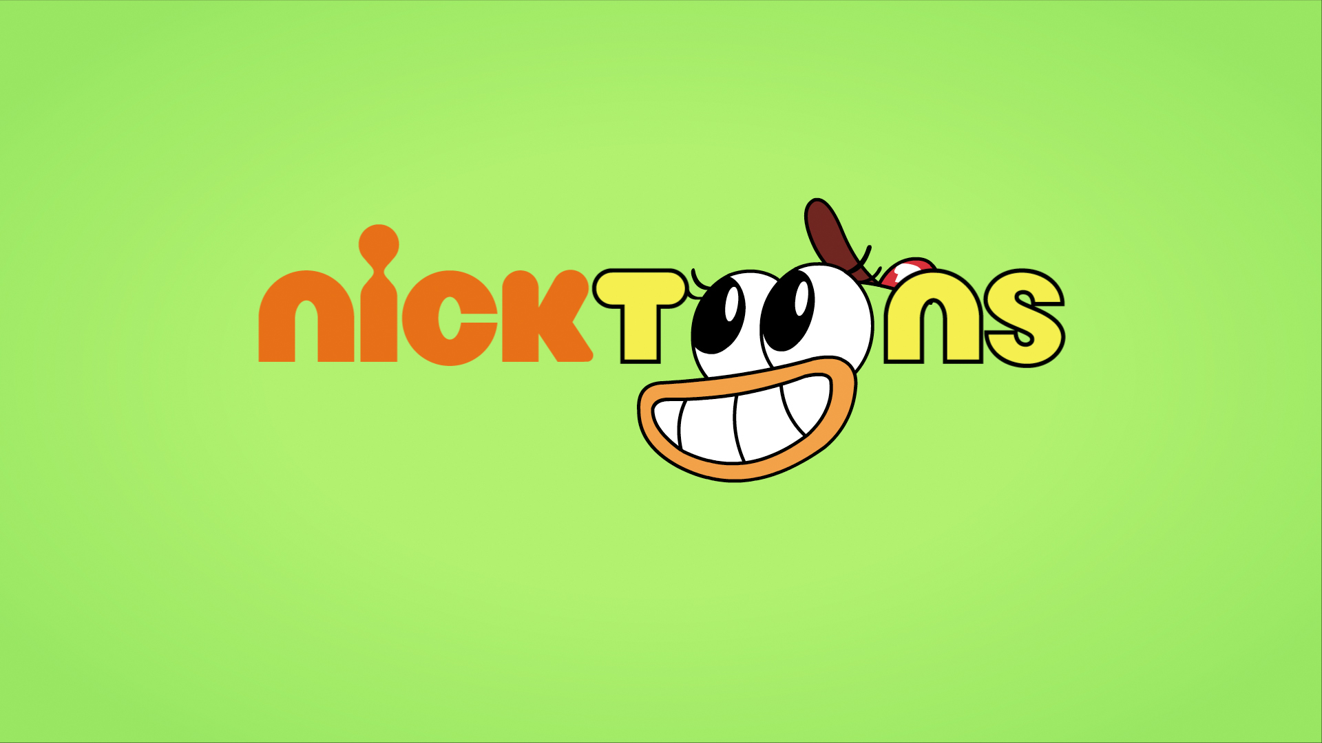

Whilst at Beautiful, we were tasked with rebranding Nickelodeon’s cartoon-only channel, Nicktoons. The brief was simple: “focus on funny” and bring the iconic characters to the forefront of the brand.
The rebrand spanned the full broadcast package — logo development, idents, stings, promo packaging, bugs, in-program pointers, and the re-skinning of existing assets to fit the new visual world.
I was involved from initial design and ideation right through to production. This included developing the look of the idents and crafting the graphical devices that tied the brand together. As this was pre-AI, every character moment was created manually — from rotoscoping well-known characters to rebuilding elements so they could perform new, bespoke actions for the idents.
The final rebrand brought character, humour, and energy back into the channel, and went on to win Silver at Promax UK for Best Channel Identity — quite literally placing the characters at the heart of the channel’s name and logo.


